How to write instructions (Dana Chisnell’s field guides for voting)

Background:

A few months ago, I came across a series of “field guides” related to voting. These were developed by Dana Chisnell of UsabilityWorks as a result of research she conducted with Ginny Redish for the National Institute of Standards and Technology.

I’m particularly interested in this topic because I worked as an election judge (the Maryland term for a precinct worker) during four elections, including two as a chief judge (one of the two chiefs at my precinct).

I’m pretty sure most voters have no inkling of the multitude of tasks and procedures that precinct workers — almost always volunteers, despite a small stipend for their effort — must try and carry out in order to ensure that people can exercise their right to vote.

The Field Guide series, “essentials that local election officials” can use when trying to apply ballot design guidelines to real life, have been edited by Dana Chisnell of UsabilityWorks. From Civic Design’s site you can download PDFs of four guides:

Designing usable ballots
Writing instructions voters understand
Testing ballots for usability
Effective poll worker materials

I want to highlight some of the recommendations from “Writing Instructions Voters Understand.” These make great sense in most job-aid and performance-support contexts, and the Field Guide provides detailed examples for the individual recommendations.

Layout

You can’t tell easily from the PDF, but in the printed Field Guide, illustrations and examples appear on the left-hand page, and instructions on the right, like this:

example voter instruction field guide pp 8 9

So you see the example in context on the left, and then you get details about it on the right.

At the beginning of the ballot, explain how to change a vote, and that voters may write in a candidate.

I think of this as a “before you begin” instruction. The voter might not be thinking about making errors or changing her mind; having this notice at the outset increases likelihood that she’ll recall it during the voting process.

Put instructions where voters need them.

This advice could sound like “be nice,” but the Field Guide gives specific examples:

  • Break instructions into groups. (No lumbering blocks of text.)
  • On paper ballots, put turn-over instructions at the bottom right-hand corner.
  • On electronic ballots, put instructions for writing in a candidate on the write-in screen.

Include information that will prevent voters from making errors.

Here’s a before-and-after approach that shows the stark contrast between insider focus and customer (or voter) focus:

(Before)

If you tear, or deface, or wrongly mark this ballot, return it and obtain another. Do not attempt to correct mistakes on the ballot by making erasures or cross outs. Erasures or cross outs may invalidate all or part of your ballot. Prior to submitting your ballot, if you make a mistake in completing the ballot or wish to change your ballot choices, you may obtain and complete a new ballot. You have a right to a replacement ballot upon return of the original ballot.

(After)

If you make a mistake, ask a poll worker for another ballot.

Use short, simple everyday words.

While I do enjoy the occasional eyeroll in the director of St. George of Orwell’s prescriptionism, Chisnell’s definitely on the right track.

Particularly with the example: Avoid jargon, such as “over vote,” “under vote,” and “partisan.”

Write in the active voice, where the person doing the action comes before the verb.

Note that this guideline is itself an example of avoiding jargon. The average person isn’t good at providing an example of an active verb as opposed to a passive one.

Write in the positive.

Directly from the guide: Tell voters what to do rather than what not to do.

(Before)

If that oval is not marked, your vote cannot be counted for the candidate.

(After)

You must fill in the oval for your vote to count.

When giving instructions that are more than one step, make each step an item in a numbered list.

It’s a lot harder for people to keep track of where they are in a bulleted list than in a number one.

When steps are a sequence, number the steps. That’s what the numbers are for: showing each item’s place within the sequence.

If sequence is not important, then use bullets.

An everyday example: the ingredients in a recipe appear before the steps. The ingredients are usually listed in the order you’ll use them, but they don’t have to be, because (presumably) the steps in the recipe will tell you when to add the carrots and when to add the vinegar.


My thanks to Dana Chisnell for agreeing to have the Field Guides included in the Ensampler.

Wine Folly’s “Different Types of Wine”

About this job aid

This chart, created by Wine Folly, is presented as an infographic. That’s mostly a matter of format. I’m happy to include it here on the Ensampler as a less-typical tool that guides a person in choosing a wine suited to his taste. Or, as Wine Folly says, it “organizes almost 200 types of wine by taste so you can easily discover new wines based on your preferences.”

(Click for original at the Wine Folly site)

What’s the accomplishment?

Identification of a type of wine based on factors like overall type of grape and preferences regarding taste.

Related to that, here’s how Madeline Puckette of Wine Folly describes her goal:

Wine is all about taste, and as a sommelier, my job is to lead customers into wine they want to drink. Most do not know what they like; they just know they want red wine or white wine.

This novice level need is how I built the first level of the flowchart.

[ Red, white, rosé, sparkling, fortified–and of course more of the wine appears in the first two categories–DF]

Beyond the first level is all about flavor affinities… For instance, if you like black coffee, you’ll probably like a bold wine with high tannin. If you prefer a latte, you might lean more towards a round and lush syrah.

Who’s the performer?

Presumably a customer choosing wine. Although the example that Puckette gives above is in a restaurant setting, her level of skill would enable her to guide the customer from memory, so it’s not likely a job aid for a sommelier.

I can see at least two types of people who’d make use of such a chart:

  • A customer curious about or considering a wine, either in a store or online. 
  • Restaurant wait staff, possibly practicing with a subset of the information, in order to increase their ability to guide patrons in the absence of a sommelier.

Comments

I’m usually not a fan of the infographic format, especially if presented as a job aid, because most such graphics by virtue of their size are impossible to use on the job. Wine Folly’s chart, though, isn’t meant to be the final word on wine selection. From Madeline Puckette’s point of view, it’s a way to help people toward an enjoyable experience with wine.

For the purposes of the Ensampler, it’s a highly concentrated way to organize a great deal of information with the goal of a satisfactory outcome.

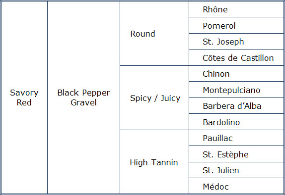
Someone who knows wine understands the differences between a Rhône and a Pomerol, even though both are in the red / savory / black pepper cluster on the chart. At the same time, that person would probably agree the two are closer to each other than either is to a Médoc. He’d also likely agree that if you say you enjoy the taste of black pepper but don’t care for things that are too spicy, a Rhône rather than a Bardolino isn’t a bad choice.

Underlying the design of the chart is the basic when/then type of consideration that goes into building a flowchart or a decision table. Here’s a sample of what I mean–a portion of the “savory red” section of the chart. For simplicity, I’ve included only four wines in each category.

savory red grid

Turning the entire Wine Folly chart into a decision table would produce one lengthy, complicated table. That’s due to the multiple factors: grape/ overall type (like sparkling); what I’ll call ‘style family’ for a grape (like sweet, savory, or fruity for red); flavor characteristics within that family (the small red circles in the Wine Folly chart); and finally characteristics like tannin versus spice versus roundness.

I’m very grateful to Madeline Puckette for sharing the thinking behind her chart, which I’ve tagged both as decision table and flowchart.

Online guide to Canadian citizenship

An online job aid?

Sure–the essence of a job aid is not the form it takes, but that it provides guidance to someone who’s completing a particular task.

In that sense, many software wizards and widgets are job aids: they enable accomplishment that would be difficult or impossible without them.

I see this online guide from Citizenship and Immigration Canada (CIC) as a kind of decision table. (You might see it as a flowchart; the two formats are siblings.)

Most decision tables lead to a specific action–file this form, start that process. This one takes a different route. In a way, it’s a quick substitute for a conversation with a CIC official, the person who’d be making a decision about your status based on your answers to the question.

That’s one reason I’m putting it in the Ensampler: it shows that you can use the job aid approach to help the clients of an organization, as well as its employees.

About this job aid

As with most countries, citizenship in Canada can be complicated. On its website, CIC has information about applying for, getting proof of, and resuming citizenship. One part of the eligibility section is “See if you may already be a citizen.” That pace includes a tool–essentially, an online decision table “to determine if you are a citizen under Canada’s citizenship laws.”

canadian citizenship tool

Note that there’s a legal disclaimer on the page: the tool “is intended solely for general guidance and reference purposes.” In other words, even if the tool says you might be a Canadian citizen, some nuance or technicality can crop up.

What’s the accomplishment?

Determining whether you’re already a Canadian citizen. This could lead to additional actions, such as deciding to apply for a certificate of citizenship or a passport.

Who’s the performer?

A person who believes he or she might be a Canadian citizen–for example, someone like myself who was born in Canada but lost Canadian citizenship as a child when his parents became naturalized citizens of another country.

An example

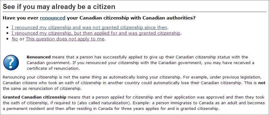
Because the online tool is informational, you can try it out for yourself, but I’ll demonstrate the process using my own case. For example, this is the first question:

Have you ever renounced your Canadian citizenship with Canadian authorities?


canadian citizenship Q1


Typically a job aid doesn’t explain why a step is performed. In this case, however, the online tool provides explanation for a technical term (renunciation) to help a person answer correctly.

In my case, the answer was “no.” That led to this sequence of questions (for which I won’t show all the screens; they’re like the example above):

Was your Canadian citizenship ever revoked for fraud?

No.

Where were you born?

In Canada.

When were you born?

Between January 1st, 1947, and February 14, 1977.
(These dates mark a period covered by the 1946 Canadian Citizenship Act.)

At the time of your birth, was either parent employed by a foreign government in Canada with diplomatic status?

No.

And the result:

Based on your answers, you are likely a Canadian citizen.

For a formal assessment of your citizenship status, you have the option of applying for proof of Canadian citizenship.

As CIC points out, for people who were born in Canada, an official birth certificate from their province or territory is often sufficient to prove citizenship. Those individuals, as well as people born outside of Canada, can also apply for a citizenship certificate.

Comments / critique

Citizenship is a complex issue. This online tool, which I see as a form of decision guide (though not strictly speaking a decision table), restricts itself to a single, easily-understood question: am I a Canadian citizen? What’s more, because of the many factors that may pertain, the best answer it produces is “likely so.”

When I answered some of the questions differently, this was the result:

Based on the information you provided, it appears that you are not a Canadian citizen.

That was followed by a list of seven possible reasons (e.g., “you are in the second or subsequent generation born outside Canada to a Canadian parent on or after April 17, 2009”).

So regardless of your citizenship status, the tool doesn’t pretend to give the ultimate decision; it simply explains what’s likely to be the case.

Shoreline assessment job aid

The National Oceanic and Atmospheric Administration (NOAA) has an Emergency Response Division concerned with the release of oil or chemicals into the environment, such as after an oil spill or natural disaster. An early step in the response is a shoreline assessment to determine facts about the contamination and to “support decision making for shoreline cleanup.”

As a visual guide to such assessment, NOAA developed its Shoreline Assessment Job Aid (PDF). Most of the job aid consists of photos illustrating such things as:

  • Amount of coverage by surface oil
  • Thickness of surface oil
  • Type of surface oil
  • Type of subsurface oil
  • Types of sediment
  • Types of shoreline

Here’s an example: photos showing amounts of coverage by surface oil.

From the Shoreline Assessment job aid; click to enlarge.

There’s also material related to beach profile (e.g., elements of a gravel beach versus a sand beach) and to more than a dozen different clean-up methods.

Since it’s made up mostly of examples and descriptions, I consider this a reference job aid.

What’s the accomplishment?

The purpose of the job aid is to have assessment team members produce consistent, accurate descriptions about the amount of contamination in a shoreline habitat.

As the job aid says, cleanup methods depend on field data about the type and degree of contamination.

Who’s the performer?

The assessment team can include the federal on-scene coordinator, NOAA scientific support staff, state on-scene coordinators, federal and state resource managers, representatives of the responsible party, landowners, and others.

Comments 

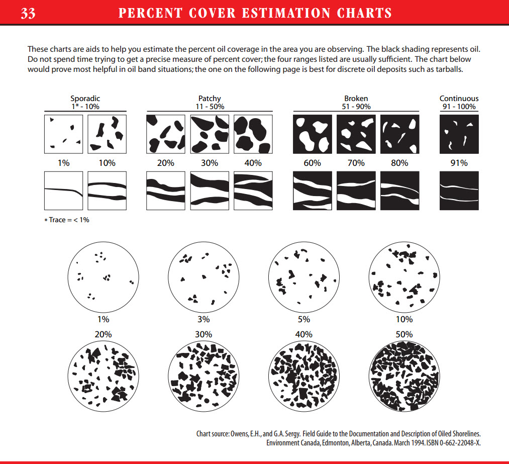
Members of an assessment team need to be in reasonable agreement as they carry out their assessment. To aid that, the job aid includes guidance to help people estimate the relative percentage of coverage.  I’ve combined two charts into one for this illustration; the square examples in the upper portion are for “oil band situations.”  The circular examples below are for “discrete oil deposits such as tarballs.”

percent cover estimate chart

Notice also the practical advice, just above the examples:

Do not spend time trying to get a precise measure of percent cover; the four ranges listed [sporadic, patchy, broken, continuous] are usually sufficient.

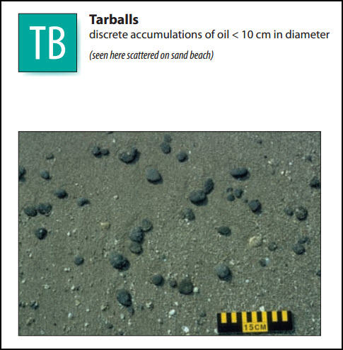
The back cover of the job aid includes a 15-centimeter ruler:

back coverA similar ruler appears in several examples in the job aid:

tarball exampleFurther information

Along with the job aid, NOAA has a Shoreline Assessment Manual that outlines the SCAT system (Shoreline Cleanup and Assessment Technique). That includes a description of team members, roles, and responsibilities; the SCAT method and process; and information about cleanup decisions based on the findings of the assessment.