About this job aid
This chart, created by Wine Folly, is presented as an infographic. That’s mostly a matter of format. I’m happy to include it here on the Ensampler as a less-typical tool that guides a person in choosing a wine suited to his taste. Or, as Wine Folly says, it “organizes almost 200 types of wine by taste so you can easily discover new wines based on your preferences.”

What’s the accomplishment?
Identification of a type of wine based on factors like overall type of grape and preferences regarding taste.
Related to that, here’s how Madeline Puckette of Wine Folly describes her goal:
Wine is all about taste, and as a sommelier, my job is to lead customers into wine they want to drink. Most do not know what they like; they just know they want red wine or white wine.
This novice level need is how I built the first level of the flowchart.
[ Red, white, rosé, sparkling, fortified–and of course more of the wine appears in the first two categories–DF]
Beyond the first level is all about flavor affinities… For instance, if you like black coffee, you’ll probably like a bold wine with high tannin. If you prefer a latte, you might lean more towards a round and lush syrah.
Who’s the performer?
Presumably a customer choosing wine. Although the example that Puckette gives above is in a restaurant setting, her level of skill would enable her to guide the customer from memory, so it’s not likely a job aid for a sommelier.
I can see at least two types of people who’d make use of such a chart:
- A customer curious about or considering a wine, either in a store or online.
- Restaurant wait staff, possibly practicing with a subset of the information, in order to increase their ability to guide patrons in the absence of a sommelier.
Comments
I’m usually not a fan of the infographic format, especially if presented as a job aid, because most such graphics by virtue of their size are impossible to use on the job. Wine Folly’s chart, though, isn’t meant to be the final word on wine selection. From Madeline Puckette’s point of view, it’s a way to help people toward an enjoyable experience with wine.
For the purposes of the Ensampler, it’s a highly concentrated way to organize a great deal of information with the goal of a satisfactory outcome.
Someone who knows wine understands the differences between a Rhône and a Pomerol, even though both are in the red / savory / black pepper cluster on the chart. At the same time, that person would probably agree the two are closer to each other than either is to a Médoc. He’d also likely agree that if you say you enjoy the taste of black pepper but don’t care for things that are too spicy, a Rhône rather than a Bardolino isn’t a bad choice.
Underlying the design of the chart is the basic when/then type of consideration that goes into building a flowchart or a decision table. Here’s a sample of what I mean–a portion of the “savory red” section of the chart. For simplicity, I’ve included only four wines in each category.
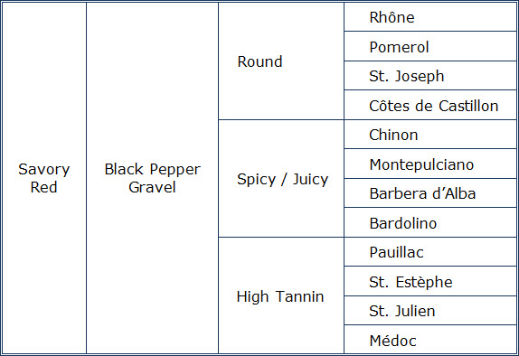
Turning the entire Wine Folly chart into a decision table would produce one lengthy, complicated table. That’s due to the multiple factors: grape/ overall type (like sparkling); what I’ll call ‘style family’ for a grape (like sweet, savory, or fruity for red); flavor characteristics within that family (the small red circles in the Wine Folly chart); and finally characteristics like tannin versus spice versus roundness.
I’m very grateful to Madeline Puckette for sharing the thinking behind her chart, which I’ve tagged both as decision table and flowchart.