Cisco router – troubleshooting flowchart

About this job aid

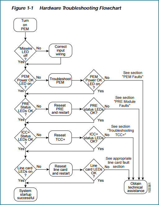
Cisco has an online guide to troubleshooting its uBR10012 Universal Broadband Router. Downloaded in PDF form, the guide comes to 86 pages. Chapter 1, which is six pages long, deals with basic troubleshooting tasks, and one tool in that chapter is this flowchart:

cisco router troubleshooting flowchart v2
PDF version of Chapter 1, Basic Troubleshooting Tasks

What’s the accomplishment?

As with any troubleshooting, there can be a couple of accomplishments. Using the flowchart may enable a technician to fix a simple situation that prevents the router from working properly. It may lead to a more detailed set of actions to diagnose and possibly resolve a more complicated problem. Or it may confirm that resolution requires a greater level of technical support.

Who’s the performer?

Cisco says that to benefit from the troubleshooting guide, “you must be experienced using Cisco IOS” and have “some responsibility for installing, configuring, or operating” their router.

That’s not me, and I’m unqualified to discuss the technical accuracy of the Cisco troubleshooting guide. I’m featuring the flowchart here because it’s an effective use of the format, and because with the rest of the guide it demonstrates multiple levels of on-the-job support.

Flowchart – a good choice for the task and the audience

A flowchart like this represents a series of decisions. You could represent the same information in a table. One argument against using a single table is that there are multiple conditions here, and each condition would be an additional column in a decision table. A decision table with five columns (four for conditions, one for the actions) gets wide and thus unwieldy.

You can get around that by creating multiple tables. For Cisco’s intended audience, though, the flowchart format probably works well. They’re presumably skilled technicians, accustomed to the flow of such diagrams.

The flowchart is concise to the point of terseness. You can’t use this job aid if you don’t know what a PEM is or what the ICC+ status is — but if that’s the case, you probably shouldn’t be messing around with the uBR10012 router, which can provide broadband for up to 64,000 subscribers.

In context, for someone who does mess around with these routers, the flowchart’s likely an effective and methodical starting point. After the first decision (is the miswire light off?), the remaining eight come in pairs of decisions like this:

  • Is the PEM Power OK LED on?
  • If not, troubleshoot the PEM.
  • When that’s done, see if the PEM Power OK LED is on now.
  • If not, see the section (chapter) on PEM faults.

Sounds obvious, but one point of a job aid is to reduce the need for memorization. Follow these steps, and you’ll cover everything you should cover.

Another point, perhaps less obvious, is that a technical job aid aims to overcome tunnel vision. Notice the four round-corner boxes running down the center: Sometimes you reseat a device; sometimes you reseat and restart. I have no idea why, but I’m pretty sure there’s a difference that matters. In the process of troubleshooting, the technical who follows the guide doesn’t waste time restarting when that’s not required.

Troubleshooting: lots more where this came from

Despite a lack of visual appeal, the flowchart and the guide it comes from represent an effective way to guide troubleshooting performance.

The flowchart itself is a summary aimed at a performer who understands its laconic style. It’s a memory jogger.

But: if the PRE status LED won’t come on, the flowchart send you to chapter 3, with its 19 pages of PRE-specific troubleshooting. Those pages include what I call procedures (sets of numbered steps, like the one for resolving console port connection problems); mini-procedures (short sets, with bullets instead of numbers); decision tables (“fault indications and recommended actions”); and different types of references (like a diagram of the PRE-1 faceplate and its indicator lights).

In other words, the Cisco uBR10012 Universal Broadband Router Troubleshooting Guide is at one level a single job aid (the job: troubleshooting the router), and at another level a collection of dozens of specialized job aids. None of this fit-it-all-onto-one-laminated-sheet silliness: if you need two pages to guide a technician through TCC+ card faults, that’s what you use.

Wine Folly’s “Different Types of Wine”

About this job aid

This chart, created by Wine Folly, is presented as an infographic. That’s mostly a matter of format. I’m happy to include it here on the Ensampler as a less-typical tool that guides a person in choosing a wine suited to his taste. Or, as Wine Folly says, it “organizes almost 200 types of wine by taste so you can easily discover new wines based on your preferences.”

(Click for original at the Wine Folly site)

What’s the accomplishment?

Identification of a type of wine based on factors like overall type of grape and preferences regarding taste.

Related to that, here’s how Madeline Puckette of Wine Folly describes her goal:

Wine is all about taste, and as a sommelier, my job is to lead customers into wine they want to drink. Most do not know what they like; they just know they want red wine or white wine.

This novice level need is how I built the first level of the flowchart.

[ Red, white, rosé, sparkling, fortified–and of course more of the wine appears in the first two categories–DF]

Beyond the first level is all about flavor affinities… For instance, if you like black coffee, you’ll probably like a bold wine with high tannin. If you prefer a latte, you might lean more towards a round and lush syrah.

Who’s the performer?

Presumably a customer choosing wine. Although the example that Puckette gives above is in a restaurant setting, her level of skill would enable her to guide the customer from memory, so it’s not likely a job aid for a sommelier.

I can see at least two types of people who’d make use of such a chart:

  • A customer curious about or considering a wine, either in a store or online. 
  • Restaurant wait staff, possibly practicing with a subset of the information, in order to increase their ability to guide patrons in the absence of a sommelier.

Comments

I’m usually not a fan of the infographic format, especially if presented as a job aid, because most such graphics by virtue of their size are impossible to use on the job. Wine Folly’s chart, though, isn’t meant to be the final word on wine selection. From Madeline Puckette’s point of view, it’s a way to help people toward an enjoyable experience with wine.

For the purposes of the Ensampler, it’s a highly concentrated way to organize a great deal of information with the goal of a satisfactory outcome.

Someone who knows wine understands the differences between a Rhône and a Pomerol, even though both are in the red / savory / black pepper cluster on the chart. At the same time, that person would probably agree the two are closer to each other than either is to a Médoc. He’d also likely agree that if you say you enjoy the taste of black pepper but don’t care for things that are too spicy, a Rhône rather than a Bardolino isn’t a bad choice.

Underlying the design of the chart is the basic when/then type of consideration that goes into building a flowchart or a decision table. Here’s a sample of what I mean–a portion of the “savory red” section of the chart. For simplicity, I’ve included only four wines in each category.

savory red grid

Turning the entire Wine Folly chart into a decision table would produce one lengthy, complicated table. That’s due to the multiple factors: grape/ overall type (like sparkling); what I’ll call ‘style family’ for a grape (like sweet, savory, or fruity for red); flavor characteristics within that family (the small red circles in the Wine Folly chart); and finally characteristics like tannin versus spice versus roundness.

I’m very grateful to Madeline Puckette for sharing the thinking behind her chart, which I’ve tagged both as decision table and flowchart.

Inspecting a fire shelter

Example of a fire shelter
Example of a deployed fire shelter

Flowcharts, along with their decision-table siblings, guide a person through choices, evaluations, or decisions. As an example of a flowchart, I’m using inspection guidelines for a personal fire shelter. The guidelines come from the USDA Forest Service website (specifically, Fire Shelter Inspection Guide and Rebag Direction).

A fire shelter is a last-ditch, personal-protection device, meant to radiate heat away from a firefighter who’s been trapped by a fire. The shelter’s pup-tent shape encloses air for the fighter to breath as the fire passes over.

The photo on the right is taken from page 16 of The New Generation Fire Shelter, a 2003 publication. Although the text doesn’t say so explicitly, a portion of the shelter appears to have been cut away so you can see how the firefighter lies within it after it’s deployed. (There are hand straps to hold the shelter down.)

Firefighters receive a fire shelter as part of their equipment, and one of their responsibilities is to inspect it regularly. That’s what the guidelines are for.

A fire shelter in its bag

The second photo shows what a fire shelter looks like in its bag. Firefighters leave the bag closed until they have to deploy it, which explains the need to inspect the bag regularly.

There’s more to the guide than appears below; I’m just highlighting its flowchart. Which is a good excuse for me to point out that most job aids are combinations of techniques–for example, step-by-step instructions (a cookbook) combined with decision guidance (like a flowchart).

Who uses this job aid?

A Forest Service firefighter or a person with similar responsibilities. While you could use this to help inspect any fire shelter, the language in the guide implies that you’re inspecting your own.

What’s the task being guided?

Determining whether a fire shelter has any defects that would render it unsafe.

Notice the number of decisions involved:

  • Is there moisture in the bag?
  • What’s the status of the bag itself?
  • Are there holes? How many, and what size?
  • Does it have a label with a red R?
  • Does it have a yellow rebag label?

I want to emphasize, because of the nature of the task, that the full guide has a number of photo examples (e.g., this is what a label with a red R looks like).

From the Fire Shelter Inspection Guide

(See full guide at the U.S. Forest Service site)

(Based on Job aid: inspecting a fire shelter
originally published on Dave’s Whiteboard.)