Makeover: widget vat assembly (the before version)

(A makeover: the before version. Here’s the after.)

In my collection of job aids, there’s a special place for a particular set of assembly instructions. I’ve created a fictional version so as not to embarrass whoever created the original, and to show ways that even extremely inferior job aids can be improved.

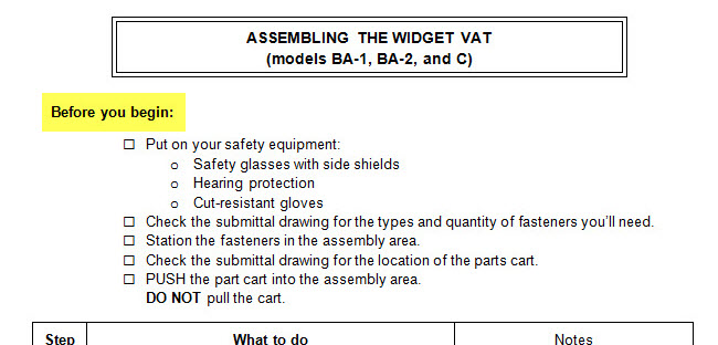
That original was a set of instructions for assembling a piece of industrial equipment that I call the widget vat. Here’s a sample page (which you can click to enlarge):

Widget vat instructions, page 1
Widget vat assembly guide, page 1

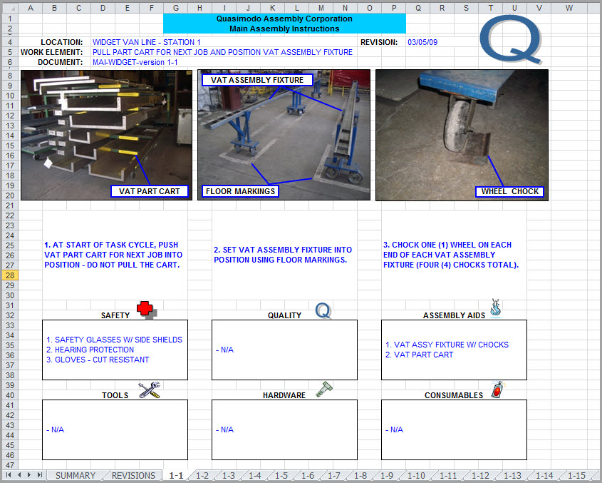
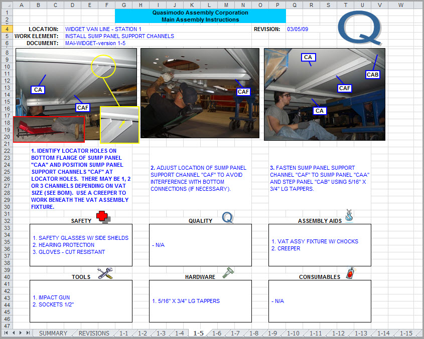
I’ve fictionalized this, as I said. There is no Quasimodo Assembly Corporation, so far as I know, and I’ve altered other identifying bits of information. Otherwise, the layout is identical to the original. That’s page one above; here’s page five:

Widget vat, page 5
Widget vat assembly guide, page 5

This job aid has a carload of problems. One of them–and by no means the most important–is that it was created in Excel. Let’s look at some of the others.

Background on the assembly guide

Suitability: what’s this job aid for? What’s its purpose?

You can ask that question from a performance-support point of view: what’s Quasimodo Assembly trying to do, and how could this job aid get it done?

The granular version is: they want to guide workers who are assembling widget vats. True so far as it goes, but I think a sharper focus comes from the desired results. I never spoke with anyone at Quasimodo, but I feel safe in expressing their goal this way:

Produce assembled widget vats that pass inspection and meet cost guidelines.

In fact, the original includes (on page 16 of 17) that kind of information:

Quasimodo's inspection standards and guidelines
Quasimodo’s inspection standards and guidelines

I haven’t posted all seventeen pages, but it’s clear that this document was meant to guide two or three people, working in a factory, through the process of assembling a piece of equipment that would fill a roomy parking space. Those people handle the job from start to finish–this isn’t something that moves down an assembly line. The process involves more than 50 steps, and several of those are variations on “repeat steps 1 to 5 for all four edges.”

Task details

Many of those steps are sequences of actions with few decisions:

  1. Position center end wall panel CAD on seembly fixture.
    • Use two people or a jib crane to life panels.
    • Check submittal [an assembly document ] for end wall connection and bottom connection orientation.
  2. Fasten center end wall panel CAD to floor plane using 5/16 x 3/4 LG tappers.
  3. Fasten center end wall panel CAD to floor support channel ZCA using 3/8 x 1-1/4 LG screws.
  4. …and so on, and so forth…

My guess is that the instructions were printed, perhaps with the pages stuffed into sheet protectors and stored in a ring binder at the assembly area. So, like most procedural job aids, they’re like a recipe.

99 problems, and Excel’s just one

Since the assemblers weren’t using Excel when consulting the guide, this deranged choice for creating it doesn’t matter all that much to them. Using Excel for text layout, however, needlessly and foolishly complicates the task of updating, revising, and even searching the source document.

Detail from page 5
Detail from page 5

More than that, layout is not even well-done within the parameters of Excel. Here’s a detail from page 5, above. Note that there are two callouts labeled CA. The accompanying text refers to CAA, CAB, and CAF.

If you had the original file, as I do, you could enlarge those callouts–the text just ran outside the space of the callout box. The assemblers could not. Whoever created this was, let’s say, not at high strength for proofreading.

The real reason that Excel is a poor choice here, though? Nothing calls for Excel. There isn’t a single calculation in the entire document. You might just as well have created the guide with photos of alphabet-letter magnets arranged on your fridge.

The format did not excel.
Letter images by Leo Reynolds; used under a CC license.

Other drawbacks (and they are many)

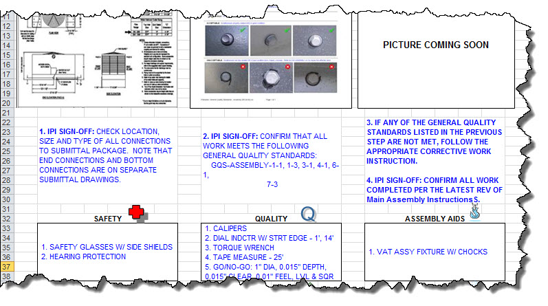
From a graphics standpoint, the widget vat guide stolidly assigns equal weight to task photos and procedural steps. They get the same amount of space, whether they need it or not.

Similarly, half of each page is take up by six equal-sized boxes, one of which (“quality”) reads “n/a” on every page but one.

So most of the time, a third of the page is doingnothing–other than confining the actual instructions to an all-capital prison.

Other barriers to effective performance:

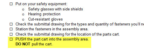
  • “Before you begin” information (like equipment you need and parts you should have) comes after the steps of the procedure.
  • Visuals are marooned in a reserved parking space instead of positioned near the step they illustrate.
  • Actual steps (the heart of a procedure) are distributed across a trio of all-caps, non-indented, top-to-bottom centered boxes:
Detail from page 6
Detail from page 6

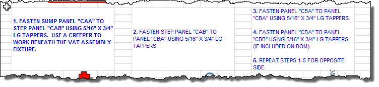
Did you notice in the detail that step 5 says “repeat steps 1 – 5?” No doubt the assemblers figured out that they didn’t need to repeat that forever, but no thanks to the designer of the guide.

 * * *

In summary, the widget vat assembly guide is hard to read, hard to follow, and hard to update. It’s not going to improve the process of assembling vats, at least not till the workers have done enough of them that they don’t need the guide any more.

In the next post, we’ll move on to what we’d change and why we’d change it. Spoiler alert: we won’t be using Excel.

Makeover: Widget vat assembly (the after version)

(A makeover: the after version. Here’s the before.)

Revision, page 1
Revision, page 1

In the previous post, I showed a fictionalized example of an actual guide for assembling a piece of industrial equipment. The original, written on seventeen sheets in an Excel workbook, had more than 50 steps. I didn’t fictionalize them all, and I haven’t tried to revise them all. I’ve done two pages that cover what 5 of the original pages did. I think these revisions are representative. (You can click each image to open a full-sized version in another window.)

By the way: I don’t have any documentation other than what’s in the original widget vat instructions. In some places, I’ve made an educated guess about details that aren’t clear; in other cases I made things up. I’ll point these out along the way.

On to the revision!

How we got here

Revision, page 2
Revision, page 2

There are a lot of steps to follow in assembling a widget vat. Based on their number, and their occasional complexity, and on my assumption that speed is not a major factor, a job aid makes sense.

And many of my revisions are part of what any good job aid should include.

A clear title

The original title, “Main Assembly Instructions,” was at best ambiguous, unless Quasimodo Corporation only assembles one thing.

Here I’m imagining that there are several models of widget vats that differ mainly in size. I’ve put the model numbers into the title so the assemblers can tell easily if these are the instructions they want.

First things first: safety and prerequisites

Every page of the original version had a box listing the same three pieces of safety equipment–as if the developer thought the assemblers might take off their safety glasses between pages 11 and 12. I’ve put them at the beginning, on the assumption that you shouldn’t be roaming the plant without your safety equipment.

I’m also assuming that the “submittal drawing” spells out things like how many fasteners you need of each type. If that were not the case, I’d have to find out from my client whether (for example) the fasteners were stored at the assembly point, and if so how the workers could get more when they needed.

Emphasizing what’s important

The original version didn’t make much effective use of contrast, alignment, or spacing, so it’s much harder to figure out what’s important. And USING ALL CAPS IS PRETTY MUCH SAYING “WHO NEEDS EMPHASIS?”

Good job aids use emphasis techniques (like capitals, boldface, or italics) in specific, consistent, limited circumstances. One of the most obvious circumstances is to highlight warnings and exceptions–DO NOT, EXCEPT, UNLESS, DANGER, and so on.

Don’t confuse people with detail

The original used over 50 photos; in my revision I’ve hardly used any. In part that’s because I didn’t have good replacements for the photos–but also because many of the original photos fail to contribute useful guidance.

One problem with the original images–and with photos in general–is that they often provide too much detail, making it hard to grasp what’s important. Or they ignore context, also making it hard to grasp what’s important.

Take a look at these three examples from the original (click to enlarge):

Details from the original instructions
  • Left: Why do I need to see a picture of the parts cart? The instructions say it’s important to push rather than pull the cart–but they don’t say if there’s a specific end I should push from. If there is, show it. If there isn’t, spell that out.
  • Center: you might be able to figure out, after studying this picture, that you’re viewing the assembly area from the side–but you can’t tell whether the top of the assembled widget will be on the left or the right.
  • Right: the instructions tell you:
    • CHOCK ONE (1) WHEEL ON EACH END OF EACH VAT ASSEMBLY FIXTURE (FOUR (4) CHOCKS TOTAL).
    • In my first revision, I’d missed the “four chocks total” part, which implies that neither the all-caps approach nor the FOUR (4) text/numeral approach helped.

image fix detail 2Although I didn’t have much to work with, I have a couple of examples of images I think would work better.

The top picture in “image detail” shows a closeup helpful for one assembly step: the flanges should face up, and they should face out from each other.

(Yes, I made up the term “bleem flange.”)

The lower picture is a line drawing rather than a photo. Line drawings are a great way to eliminate unnecessary detail. I’ve teried to reduce details to the essentials: you’re fastening two (more-or-less) L-shaped pieces together, and you fasten through holes that alternate large/small/large/small.

(I’ve made the assumption here that the assembler should alternate directions when fastening these things: one fastener from one side, the next from the opposite side. If it were important to do that alternating while fastening, I’d add a box to spell that out. If you can install all the fasteners from one side, and then from the other, I’d spell that out. )

Some  problems in the original version stem from the decision to always use three photos per page in the original. That’s a lot like deciding that you need to use one semicolon per paragraph: not wrong, exactly, but needlessly specific.

What I’d do instead:

  • Leave out the cart photo. My assumption: the assemblers know what the parts cart looks like. If they don’t, they shouldn’t be assembling widget vats.
  • Possibly include a close-up of the portion of the cart that I’m supposed to push, assuming there’s some sort of handle or push plate.
  • Use a bird’s-eye-view line drawing to show the layout of the assembly area.
    • In the text for this step in my revision, I made up some floor guidelines to show “top” and “bottom” of the assembled widget.
    • I also made up guidelines on the frame to show where to place some of the initial pieces.
  • Clarify where to place the wheel chocks.
    • Chock one wheel of each assembly fixture.
      • Written this way, it doesn’t matter how many fixtures you have, so you don’t need the FOUR (4) business so beloved by people writing procurement specs.
    • Place the chock so it’s closer to the center of the fixture than the wheel it’s touching. (If this is a best practice; I have no idea.)

Trying to build a useful set of performance guides like this can be a tool for analysis tool as well. You can’t create a successful guide without knowing what the inputs are, what the process is, what the outputs are, and what the standards for success are.

How many assembly fixtures do I need? On the framework, which side represents the top of the assembled piece? Can I install 20 fasteners in one direction, all in a row, and then 20 in the other? And what the hell is a “submittal drawing,” let alone the cryptic “BOM?”

What’s more, you can identify items that don’t need to be in the guide. Frankly, I think it’s…perhaps less than helpful to list “vat part cart” as an assembly aid. That’s like saying, “In order to build your IKEA Poang chair, buy the Poang chair and bring it home.”

Makeover: a tech reference job aid

This is the first in an occasional series in which I’ll improve an existing job aid and explain the reasons for the changes.

The original

Weight Monitor indicator lights (original)This is a fictionalized version of a table found in a user manual for some electronic equipment. I’ve changed details to refer to the (imaginary) MacLellan Weight Monitor, a type of checkweigher. The Weight Monitor checks the weight of boxes of pharmaceuticals on a packaging line.  (I’ve put some background at the end of this post, but it’s not essential to the job aid makeover.)

The original job aid is a reference to show various statuses that the Weight Monitor can have, as well as the indicator lights that display for each status. I’ve rewritten some of the statuses here, but the language of the original is similar.

Weak points

What’s wrong with the original?

PurposeWhat’s the table for?

A technician might say “it tells you what status the different lights represent,” but the way it’s set up, it really tell you “if the status is X, then the lights will be Y.” On the job, the user can already see the lights; he wants to know what they mean.

Language: It’s not obvious from the table, but the typical user will not be familiar with terms like initialization, configuration, to say nothing of parameter failure. Too many engineers, not enough packaging line operators.

Title: not  helpful. As is, could just as well be left off.

Organization:  How is this table organized? Not by sequence, not by frequency, not alphabetical by status, and not alphabetical by color.

The makeover
weight-monitor-03-makeover-a
What and why

Purpose: explain what the Weight Monitor’s lights mean.

The new version shows the when/then principle in action: start with what the worker sees or receives or experiences — in this case, the colors of the lights. So colors go on the left: “WHEN the light is flashing red…”

Once you have the color, you move to the meaning: “THEN there’s a jam where the packages exit the Weight Monitor.”

In the original version, the layout was backwards: the left column showed meanings, and I had to skim each one and check its color in order to figure out what a flashing red light meant.

Language

Starting with “device status,” which is now “what it means,” I’ve rewritten several items to be clearer from the worker’s point of view. “Parameter failure” was the engineering way to say that a package didn’t fail within the minimum / maximum weight range. Either way, the Weight Monitor will bump the package off the line and flash red and yellow lights. “Package over or under weight” is clearer.

Title

As simple as it seems, “Weight Monitor status” sets the table in context. What the engineers called indicator lights are meant to show the status of the machine in the workplace.

…As for organization, this first draft has the same order (or lack of order) as the original. I can see a number of ways to arrange the rows, such as by sequence in the process. But in a second pass, I went with color:

Makeover, version two

weight-monitor-03-makeover-a

There are a lot of colors here. I decided to put the single colors first, in green-yellow-red order, followed by the combinations. In the case of those multi-color states, “flashing red and yellow,” like most of the items above it, relates to the operation of the packaging line. The last two combinations are one-time indicators that you’d see when you started the device up (initialization) and once you’d entered the programming for the specific item you were packaging (configuration).

Background on the Weight Monitor:

As part of the packaging process, Dosage Pharmaceutical programs the Weight Monitor with an acceptable weight range for one packaging unit. For example, when the line is packaging physician samples for 200-milligram doses of Nullaproxin, the package unit is one carton, and the weight is based on:

– The carton itself, its label, and its seal
– An eight-page information package for the physician
– 24 wallets (the medication sample package given to a patient)

Each wallet is made up of a cardboard case, 14 plastic blisters (thermoplastic bubbles and foil backing), one tablet per blister, and an information sheet for the patient.

Each carton moves onto the Weight Monitor. If the carton is too light or too heavy, based on the configuration for the specific product, the Weight Monitor bumps the package into a bin for a worker to determine and remedy the problem.