What’s a job aid? (A look inside the box)

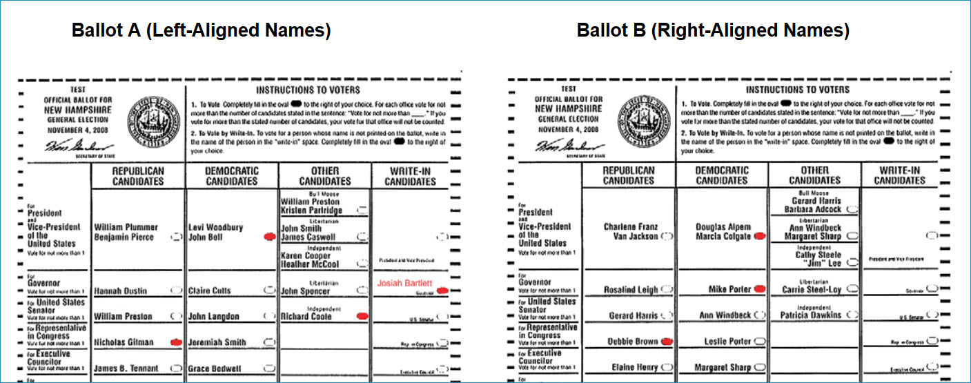
A definition I’ve been working on:

A job aid is:

External information
designed to reduce reliance on memory
that someone uses to accomplish results
that they otherwise couldn’t.

External information

When someone’s got information inside their head that they can retrieve and apply when needed, we say they’ve learned that information. Think of a job aid as holding information that doesn’t need to be learned.

There’s more of that than you might think.

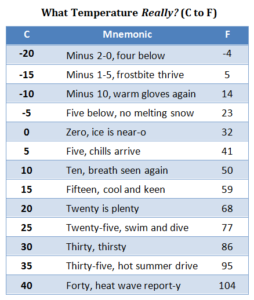
You can’t calculate flood insurance premiums if you haven’t learned what insurance means or can’t do basic math.  With a guide like the chart below, though, you don’t need to have learned the coverage limits for different buildings nor the applicable rates. They’re stored in the job aid.

A chart showing fictional costs for flood insurance, based on the type of building and the desired amount of coverage.
Flood insurance premiums for different buildings. (Not actual premiums. Also, this blog does not sell flood insurance.)

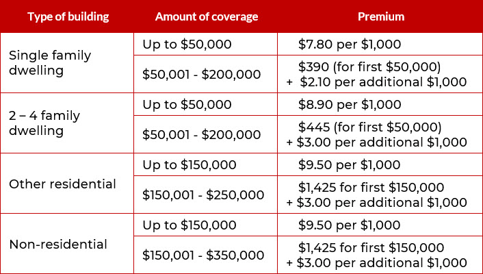
You can probable figure the premium for $200,000 of flood insurance on a 2-family dwelling, even without being a licensed agent.*  And if you are an agent, such a chart reduces your cognitive load.

*  Calculating the flood insurance premium:
— When the type of building is “2-4 family dwelling,” and 

 — when the amount of coverage is $200,000,
 — then the premium is $445 for the first $50,000…
— plus $3 per thousand for an additional $150,000 ($3 x 150 = $450).

The premium is $895.

…designed to reduce reliance on memory…

I use “memory” instead of “learning” when I’m talking about job aids, mostly to highlight the kind of information that typically doesn’t need to be stored in memory. Often that’s voluminous facts, or infrequently-used information, or information that’s likely to change.

I once was a ticket agent for Amtrak. After a few months on the job, I could quote the fares from Detroit, where I worked, to about 50 different cities, including the family-plan discounts for accompanying spouse or children.

When the fares changed, I had to consult the tariff (the official rates and rules), just as when I needed to do something unusual for my office, like write  Metroliner tickets or group tours. There was no point in my storing those steps in memory–too complicated, and too infrequent, to justify the effort.

It’s true that in some circumstances, repeated use of a job aid will help you learn the information it contains. That’s the training-wheels effect: repeated application of the job aid makes you familiar with its contents. You start storing some of the content in your own memory.

(Whether that’s always a good idea is a different consideration.)


…that someone uses to help accomplish results…

By accomplish, I have two things in mind.

First, there’s the completion of whatever the task is. Once you’re finished, what do you have that you didn’t have when you began? The task of calculating a flood insurance premium has as its result a specific flood insurance premium for a specific level of coverage on a specific structure.

Workers at NASA celebrate the successful landing of the Perseverance rover.
NASA’s Perseverance rover lands on Mars.
Safely. In working order. NASA photo.

The second thing I have in mind is that the results meet requirements. Did the thing you completed achieve your goal? Was the insurance calculation correct for the type of building and the amount of coverage?

Accomplishment is crucial for job aids. If someone can produce accurate flood insurance quotes using the job aid, without memorizing the types of structures, levels of coverage, and rates at each level, what’s the rationale for requiring such memorization?

That’s not to say “job-aid everything.” Rather, there’s often a lot of inertia and ritual about knowing things rather than looking them up. The effort to accurately and reliably memorize a great deal of factual information isn’t always justified by the effort nor by post-memorization performance.


…that they otherwise couldn’t.

This phrase is the flip side of the “accomplish” part.

It underscores the way a job aid makes task-specific information external, and the way it supports a person who doesn’t have that information stored in their head. Without the flood insurance chart or prior skill in producing premium quotes, you couldn’t calculate a appropriate rate. With the chart — a job aid storing external information designed to reduce reliance on memory, while helping you produce an accomplishment that you couldn’t have otherwise — you can.

Just like it says on the box.

Searching for faucet parts, or, tapping into results

Job aids are part of a broader category called performance support.

Performance support is a tool or other resource, from print to technology-supported, which provides just the right amount of task guidance, support, and productivity benefits to the user—precisely at the moment of need.

– Marc J. Rosenberg,
At the Moment of Need: The Case for Performance Support
(eLearning Guild membership required).

The faucet in question

I came across a great example of effective performance support thanks to… a loose faucet handle.

That handle on my kitchen faucet needed to be in just the right position or the faucet would drip. I noticed some wear and wondered if I could get replacement parts.

This is a Moen faucet, but I didn’t have the model name, and I couldn’t find the part number.

I went to Moen’s website, and I was impressed enough with how it dealt with my situation that I’m discussing it here.

If you’re supporting performance, you start with the performance you think needs some support. At a minimum, this means you need to know what gets accomplished and who’s going to accomplish it.

I think it’s helpful to explore why (as in, what’s the result for, and likely, who’s the client or recipient of the result), but that’s a topic for another post. This time, the ultimate client is me, a person with a leaking faucet.

Moen’s approach to performance support

At the bottom of Moen’s home page, you find this:

Need support?
Need support?

Moen can find a product by name (the Align faucet) or by model number (the 7565 series). The box on the left has a link to help you find the model number.

These are the fast paths to finding information: assuming you’ve got the right name or number, you’re well on the way. But I didn’t have either of these things, so the right-hand box was waving to me with its practical button, “Identify my product.”

Let's start by finding your product
Let’s start by finding your product

I could think of many ways to categorize faucets and related parts, but this is a truly consumer-focused question: what room are we in?

Which room are we in?

“Kitchen” was the choice, of course. (I don’t know if Moen makes outdoor faucets, but if that’s what I was looking for, I’d choose the “laundry and utility” category and see.)

Two things I noticed at this point. First, we’ve only got those Moen products you’d find in the typical kitchen: faucets, and garbage disposals.

Less obvious, at the top of this image, under the word category: there are 1868 possible items. That’s a lot of stuff to sort through. I clicked “kitchen faucets.

What kind of faucet?

I really like this combination of text and images to help guide me in refining my search. Just by choosing kitchen faucet, I’ve reduced the possible items by a third (from 1868 to 1222). I might not have been aware of what a pot filler faucet is, but now I have an idea. And if I’m not clear on the difference between a kitchen sink faucet and a beverage faucet, I can always choose “not sure.”

Kitchen sink it is.

I’ve eliminated another 50 possible faucets, and the invisible expert nudges me along. I don’t have to know much about plumbing to count handles. My own faucet (remember, the one with the leak?) had one.

Pull out or pull down?

Continuing down the logic path, we’ve eliminated about half the possible matches from that first screen. As far as I can tell, the big difference between pullout faucets and pulldown ones is the height of the faucet. Mine was clearly a pulldown.

Select a finish
Select a finish

Only 314 faucets, and only 10% of them have a chrome finish.

36 chrome faucets
36 chrome faucets

When I scrolled through the results, though, I didn’t find my own faucet. It turns out Moen was prepared for further inquiry, which I probably could have chosen earlier.

Show discontinued products

More responses this time. I paged through the list, and if you compare the photo I started with with this result, you’ll see I have the discontinued Trianna faucet.

Is this a job aid? And if not, does it matter?

Job aids are one form of performance support. My definition is that they contain information external to the performer, used on the job to reduce the need for memorization while enabling results.

Moen’s support page definitely supports the goal of finding a particular faucet. All the information is external. In a sense, there’s no memorization, assuming that you know what a faucet is, what the rooms are, and so on.

Moen’s search isn’t intended to guide plumbing professionals so much as consumers. For them, digging out faucet information is not part of their job. It’s a potential obstacle on the way to a result like finding faucet parts or locating a family of models (say,  to find kitchen faucets that match the bathroom ones).

So the difference I see is relatively minor. The performance is infrequent, and nearly all the information got built into a system such that the search (and the guided decisions) seem like part of the task, rather than explicit suggestions on how to go about the task. The built-in aspect is a different way of handling “external information” than placing it into a job aid that someone uses along with the system or tools that enable the accomplishment.

What’s common to either approach is a highly detailed analysis that in this case made the faucet search flow smoothly.


Designing ballots – an experiment in form layout

Documents and other tools that the public interacts with are a kind of performance support; the goal is to help people accomplish things they want or need to do. Job aids are one form of performance support, and I see a ballot as a kind of collector worksheet (as opposed to one that helps calculate): information on the ballot form is organized, typically by office or issue, and the voter has a way to indicate her selection.

The Center for Civic Design has for its goal making “every interaction between government and citizens easy, effective, and pleasant.” I’ve just come across a post of theirs from 2008 that discusses in depth a usability test for state ballots in New Hampshire.

The test looked at a single question: is it better to left-align the names of candidates, or to right-align them so each name is as close as possible to the circle that the voter would fill in?

Examples of two layouts for a ballot. On Ballot A, names are left-aligned. On Ballot B, names are right-aligned so as to be close to the circle that a voter would fill in.
Examples of the two ballot formats, from the CCD’s usability test report.

From a performance improvement viewpoint, and as someone who’s worked as an election judge several times, I found the discussion in the full report enlightening. As for the conclusions, participants in the test who used Ballot B:

  • Took slightly less time to vote.
  • Made fewer errors.
  • Preferred Ballot B to Ballot A.

From CCD’s conclusions:

Although the difference in the number of errors made by participants when voting on Ballot A and Ballot B is not statistically significant, the data indicate that there is a trend toward fewer errors when voting on Ballot B. For this reason, we recommend the use of Ballot B (right-aligned names) for the general election in November.
A strong proximity relationship between candidate names and fill-in ovals is more important than the alignment of names on the ballot.

Work in progress: my session scanner

Job aid design usually starts with an analysis that asks  about conditions, steps, signals, responses, the desired accomplishment, and its criteria.

In this post, I’m showing a job aid I created that started from a different point: something I wanted to have, but didn’t.

What’s the problem?

My Building Job Aids workshop is made up of parts I think of as elements. One might be a mini lecture; one might be an activity to produce a decision guide; another, a quick judge-these-examples round I call Best in Show.

Although I have a plan for each session, the actual workshop varies from the plan. I shorten or drop or swap elements based on the skills and interests of the participants (or, sometimes, the relentless ticking of the clock). And after the fact, I go over what took place and decide what I want to do or do differently next time.

This isn’t easy to manage when you’re mainly concerned with running the workshop. What kind of support was I looking for?

  • A list of planned elements, with an easy way to see duration and order.
  • A list of potential elements that I could add or substitute on the fly.
  • A tool to track the elements, duration, and sequence I actually used, including any changes.
  • A way to record short notes in passing.
Enter the session scanner

I tried several layouts before deciding that what worked for me was a half-day plan on a single page. (For a full-day, I’ve got a second page with the afternoon hours.) 15 minutes felt like the smallest chunk of time, so it became the basis for a grid. Here’s what the scanner looks like when I’m done planning:

The session scanner
The session scanner. (Click to enlarge.)

In the Planned column, the shapes represent individual elements, like the Makeover activity scheduled for 11. The height stands for the planned duration. The color around an element doesn’t mean anything; I just find them easier to distinguish when they’re not all the same color.

The Actual column is for tracking what elements I used, and how long they took in the real world.

You can figure out what the Notes column is for. And the Options column in the example lists three elements that I can add or substitute on the fly.

In the element shapes, checkboxes remind me about supporting materials for the particular element. Bullet items summarize of the main steps or stages.

The scanner at work

The next example shows the scanner after I finished the first element: an arrow to indicate elapsed time, and a couple of notes. (“Drafts had lots of ‘why'” would be important to me — suggesting the activity was not making the point that there shouldn’t be much “why” in this job aid.)

Duration with notes
Duration with notes

Next, the scanner about an hour later. The Analyze element didn’t take as long as planned, so I added the optional Paradigm Demo element.

Optional element added

One more example. The BermCo activity started later than planned, and also ran longer. My notes remind me that there were extra questions during the “check” stage, and that the debrief activity also ran long but didn’t strike me as a problem. (This example also shows the highly innovative “cross it out” method of showing a dropped element.)

More tracking, including a deletion
So far, so good

If I were faster at digital note-taking on the fly, I might create an electronic version of the scanner and keep it on a tablet. But I’d want to avoid lag from a screen that had blacked out, and I’d need a way to write notes at least as fast and as legibly that I can using pen and paper.

All in all, I’m pleased with the current incarnation of the session scanner. It helps me in preparation, in delivery, and in post-session analysis.

Makeover: widget vat assembly (the before version)

(A makeover: the before version. Here’s the after.)

In my collection of job aids, there’s a special place for a particular set of assembly instructions. I’ve created a fictional version so as not to embarrass whoever created the original, and to show ways that even extremely inferior job aids can be improved.

That original was a set of instructions for assembling a piece of industrial equipment that I call the widget vat. Here’s a sample page (which you can click to enlarge):

Widget vat instructions, page 1
Widget vat assembly guide, page 1

I’ve fictionalized this, as I said. There is no Quasimodo Assembly Corporation, so far as I know, and I’ve altered other identifying bits of information. Otherwise, the layout is identical to the original. That’s page one above; here’s page five:

Widget vat, page 5
Widget vat assembly guide, page 5

This job aid has a carload of problems. One of them–and by no means the most important–is that it was created in Excel. Let’s look at some of the others.

Background on the assembly guide

Suitability: what’s this job aid for? What’s its purpose?

You can ask that question from a performance-support point of view: what’s Quasimodo Assembly trying to do, and how could this job aid get it done?

The granular version is: they want to guide workers who are assembling widget vats. True so far as it goes, but I think a sharper focus comes from the desired results. I never spoke with anyone at Quasimodo, but I feel safe in expressing their goal this way:

Produce assembled widget vats that pass inspection and meet cost guidelines.

In fact, the original includes (on page 16 of 17) that kind of information:

Quasimodo's inspection standards and guidelines
Quasimodo’s inspection standards and guidelines

I haven’t posted all seventeen pages, but it’s clear that this document was meant to guide two or three people, working in a factory, through the process of assembling a piece of equipment that would fill a roomy parking space. Those people handle the job from start to finish–this isn’t something that moves down an assembly line. The process involves more than 50 steps, and several of those are variations on “repeat steps 1 to 5 for all four edges.”

Task details

Many of those steps are sequences of actions with few decisions:

  1. Position center end wall panel CAD on seembly fixture.
    • Use two people or a jib crane to life panels.
    • Check submittal [an assembly document ] for end wall connection and bottom connection orientation.
  2. Fasten center end wall panel CAD to floor plane using 5/16 x 3/4 LG tappers.
  3. Fasten center end wall panel CAD to floor support channel ZCA using 3/8 x 1-1/4 LG screws.
  4. …and so on, and so forth…

My guess is that the instructions were printed, perhaps with the pages stuffed into sheet protectors and stored in a ring binder at the assembly area. So, like most procedural job aids, they’re like a recipe.

99 problems, and Excel’s just one

Since the assemblers weren’t using Excel when consulting the guide, this deranged choice for creating it doesn’t matter all that much to them. Using Excel for text layout, however, needlessly and foolishly complicates the task of updating, revising, and even searching the source document.

Detail from page 5
Detail from page 5

More than that, layout is not even well-done within the parameters of Excel. Here’s a detail from page 5, above. Note that there are two callouts labeled CA. The accompanying text refers to CAA, CAB, and CAF.

If you had the original file, as I do, you could enlarge those callouts–the text just ran outside the space of the callout box. The assemblers could not. Whoever created this was, let’s say, not at high strength for proofreading.

The real reason that Excel is a poor choice here, though? Nothing calls for Excel. There isn’t a single calculation in the entire document. You might just as well have created the guide with photos of alphabet-letter magnets arranged on your fridge.

The format did not excel.
Letter images by Leo Reynolds; used under a CC license.

Other drawbacks (and they are many)

From a graphics standpoint, the widget vat guide stolidly assigns equal weight to task photos and procedural steps. They get the same amount of space, whether they need it or not.

Similarly, half of each page is take up by six equal-sized boxes, one of which (“quality”) reads “n/a” on every page but one.

So most of the time, a third of the page is doingnothing–other than confining the actual instructions to an all-capital prison.

Other barriers to effective performance:

  • “Before you begin” information (like equipment you need and parts you should have) comes after the steps of the procedure.
  • Visuals are marooned in a reserved parking space instead of positioned near the step they illustrate.
  • Actual steps (the heart of a procedure) are distributed across a trio of all-caps, non-indented, top-to-bottom centered boxes:
Detail from page 6
Detail from page 6

Did you notice in the detail that step 5 says “repeat steps 1 – 5?” No doubt the assemblers figured out that they didn’t need to repeat that forever, but no thanks to the designer of the guide.

 * * *

In summary, the widget vat assembly guide is hard to read, hard to follow, and hard to update. It’s not going to improve the process of assembling vats, at least not till the workers have done enough of them that they don’t need the guide any more.

In the next post, we’ll move on to what we’d change and why we’d change it. Spoiler alert: we won’t be using Excel.

Makeover: Widget vat assembly (the after version)

(A makeover: the after version. Here’s the before.)

Revision, page 1
Revision, page 1

In the previous post, I showed a fictionalized example of an actual guide for assembling a piece of industrial equipment. The original, written on seventeen sheets in an Excel workbook, had more than 50 steps. I didn’t fictionalize them all, and I haven’t tried to revise them all. I’ve done two pages that cover what 5 of the original pages did. I think these revisions are representative. (You can click each image to open a full-sized version in another window.)

By the way: I don’t have any documentation other than what’s in the original widget vat instructions. In some places, I’ve made an educated guess about details that aren’t clear; in other cases I made things up. I’ll point these out along the way.

On to the revision!

How we got here

Revision, page 2
Revision, page 2

There are a lot of steps to follow in assembling a widget vat. Based on their number, and their occasional complexity, and on my assumption that speed is not a major factor, a job aid makes sense.

And many of my revisions are part of what any good job aid should include.

A clear title

The original title, “Main Assembly Instructions,” was at best ambiguous, unless Quasimodo Corporation only assembles one thing.

Here I’m imagining that there are several models of widget vats that differ mainly in size. I’ve put the model numbers into the title so the assemblers can tell easily if these are the instructions they want.

First things first: safety and prerequisites

Every page of the original version had a box listing the same three pieces of safety equipment–as if the developer thought the assemblers might take off their safety glasses between pages 11 and 12. I’ve put them at the beginning, on the assumption that you shouldn’t be roaming the plant without your safety equipment.

I’m also assuming that the “submittal drawing” spells out things like how many fasteners you need of each type. If that were not the case, I’d have to find out from my client whether (for example) the fasteners were stored at the assembly point, and if so how the workers could get more when they needed.

Emphasizing what’s important

The original version didn’t make much effective use of contrast, alignment, or spacing, so it’s much harder to figure out what’s important. And USING ALL CAPS IS PRETTY MUCH SAYING “WHO NEEDS EMPHASIS?”

Good job aids use emphasis techniques (like capitals, boldface, or italics) in specific, consistent, limited circumstances. One of the most obvious circumstances is to highlight warnings and exceptions–DO NOT, EXCEPT, UNLESS, DANGER, and so on.

Don’t confuse people with detail

The original used over 50 photos; in my revision I’ve hardly used any. In part that’s because I didn’t have good replacements for the photos–but also because many of the original photos fail to contribute useful guidance.

One problem with the original images–and with photos in general–is that they often provide too much detail, making it hard to grasp what’s important. Or they ignore context, also making it hard to grasp what’s important.

Take a look at these three examples from the original (click to enlarge):

Details from the original instructions
  • Left: Why do I need to see a picture of the parts cart? The instructions say it’s important to push rather than pull the cart–but they don’t say if there’s a specific end I should push from. If there is, show it. If there isn’t, spell that out.
  • Center: you might be able to figure out, after studying this picture, that you’re viewing the assembly area from the side–but you can’t tell whether the top of the assembled widget will be on the left or the right.
  • Right: the instructions tell you:
    • CHOCK ONE (1) WHEEL ON EACH END OF EACH VAT ASSEMBLY FIXTURE (FOUR (4) CHOCKS TOTAL).
    • In my first revision, I’d missed the “four chocks total” part, which implies that neither the all-caps approach nor the FOUR (4) text/numeral approach helped.

image fix detail 2Although I didn’t have much to work with, I have a couple of examples of images I think would work better.

The top picture in “image detail” shows a closeup helpful for one assembly step: the flanges should face up, and they should face out from each other.

(Yes, I made up the term “bleem flange.”)

The lower picture is a line drawing rather than a photo. Line drawings are a great way to eliminate unnecessary detail. I’ve teried to reduce details to the essentials: you’re fastening two (more-or-less) L-shaped pieces together, and you fasten through holes that alternate large/small/large/small.

(I’ve made the assumption here that the assembler should alternate directions when fastening these things: one fastener from one side, the next from the opposite side. If it were important to do that alternating while fastening, I’d add a box to spell that out. If you can install all the fasteners from one side, and then from the other, I’d spell that out. )

Some  problems in the original version stem from the decision to always use three photos per page in the original. That’s a lot like deciding that you need to use one semicolon per paragraph: not wrong, exactly, but needlessly specific.

What I’d do instead:

  • Leave out the cart photo. My assumption: the assemblers know what the parts cart looks like. If they don’t, they shouldn’t be assembling widget vats.
  • Possibly include a close-up of the portion of the cart that I’m supposed to push, assuming there’s some sort of handle or push plate.
  • Use a bird’s-eye-view line drawing to show the layout of the assembly area.
    • In the text for this step in my revision, I made up some floor guidelines to show “top” and “bottom” of the assembled widget.
    • I also made up guidelines on the frame to show where to place some of the initial pieces.
  • Clarify where to place the wheel chocks.
    • Chock one wheel of each assembly fixture.
      • Written this way, it doesn’t matter how many fixtures you have, so you don’t need the FOUR (4) business so beloved by people writing procurement specs.
    • Place the chock so it’s closer to the center of the fixture than the wheel it’s touching. (If this is a best practice; I have no idea.)

Trying to build a useful set of performance guides like this can be a tool for analysis tool as well. You can’t create a successful guide without knowing what the inputs are, what the process is, what the outputs are, and what the standards for success are.

How many assembly fixtures do I need? On the framework, which side represents the top of the assembled piece? Can I install 20 fasteners in one direction, all in a row, and then 20 in the other? And what the hell is a “submittal drawing,” let alone the cryptic “BOM?”

What’s more, you can identify items that don’t need to be in the guide. Frankly, I think it’s…perhaps less than helpful to list “vat part cart” as an assembly aid. That’s like saying, “In order to build your IKEA Poang chair, buy the Poang chair and bring it home.”

Assembling an IKEA desk (a complex job aid, part 1)

(Part 1 of 2; here’s Part 2.)

With most of the job aids I’ve discussed on the Ensampler, I’ve focused on a main purpose–the job aid as primarily a reference or primarily a decision-guiding flowchart, for instance.

ikea-galant-frame-coverHere, I’m analyzing a familiar type of job aid: IKEA instructions. I’ve chosen the guide for IKEA’s Galant desk. The goal of this guide is to help someone attach legs to a metal frame, and then attach the frame to a desktop.

Many people think of IKEA instructions as mainly procedural (step-by-step guides). The Galant instructions are more complex—they cover forty pages, so a single guide can help a consumer assemble any of the thirty-two different Galant configurations, based on size, shape, optional extensions, and so on. (You buy the frame, top, extensions, and legs separately; the instructions come with the frame.)

Beyond number of pages, though, what’s significant is how the Galant instructions support several types of accomplishment. I’ve split the discussion into two similar-sized chunks:

Part 1 (this post)

  • Background on the Galant desk
  • The decision guide section of the instructions, to help you find steps for the specific configuration of Galant desk you have,
  • The concise, detailed checklist that shows the quantity and type of each part needed for each combination of frame, top, extension, and legs

Part 2 (the next post)

  • The detailed procedural steps for your specific assembly.

Galant: the Background

While IKEA’s Galant series of office furniture has been replaced by the similar Bekant series, I’m deeply familiar with the Galant; I had the corner desk in my office for years.

Galant corner desk (160 x 120 cm) with side table (80 x 60 cm) to the left

That’s my old desk in the photo. IKEA calls it a left-hand desktop: one piece whose main, rectangular form curves  into a smaller section on the left.

I didn’t join any extensions to mine, but as you’ll see, all the tops were designed to match up with various extensions.

The tops and extensions attach to a metal frame whose components depend on the configuration.  And two types of legs — angled or T-shape — attach to the frame. For a clearer picture of how things come together, here’s a short video of two Galants being assembled. Both of these include a rectangular extension, so each desk is larger than mine was.)

Decisions, decisions

As near as you configure
For the desk you have, see the page indicated.

Page 3 of the instructions is a wordless decision guide: based on the configuration you’ve chosen, turn to page X.

This page shows thirty-two different combinations of desk elements. Like a good reference, though, it organizes and categorizes.

Each row set off by a line contains combinations that follow the same basic assembly steps. The third row down, for example, shows ten different combinations of desk that all follow the steps on page 10.

ikea-galant-row-3

You could find many approaches to organizing this decision. It’s not hard to imagine an product-centric one that started with the part number for each size of frame. What IKEA has done well here is to focus on the customer’s goal: a particular desk.

The customer likely compared several configurations and so is likely to recognize the one he chose. What’s especially helpful here is that IKEA relies on generalization: each row is a set of distinct  items (the configurations) that leads to the same response (steps for assembly).

Checklist: which, where, and how many

Page 4 of the Galant guide has this chart:

ikea-galant-page-4

It’s a checklist, dressed up like a reference.

A checklist, because you choose the type of leg, frame, or extension you’re working with, and then read across to see how many parts of each type you need. The focus of a checklist is coverage or completion: make sure you have all these parts.

Here too there’s an assumption that the consumer knows what’s going on.  The last two rows of the page 4 chart are for different types of desk extensions. You wouldn’t have those if you didn’t have the main desk, and so IKEA is relying on you to chunk your part-identification:

  • Parts for the type of leg your desk will have (the first two rows)
  • Parts for the main portion of the frame you’re using (rows three through six)
  • Parts for the extension

In addition, IKEA steps outside strict rules when it comes to parts for the T-leg. There’s a special size of hex wrench for these legs; it’s used to adjust their height. That size isn’t used for any other part in the Galant family, and so that specific wrench (100092) appears in the right-hand column, where you’d expect either a blank or a 1 (which would indicate you needed wrench 108490.

ikea-galant-page-4-detail-2

I’m not sure I would have designed this chart that way, but I think it’s effective. Even if you hadn’t started assembling your desk, you’d be likely to say “I should have this particular wrench,” and it would have come in the package with the T-leg.

As I said, the parts chart is a checklist–but if you keep your IKEA instructions, as I do, it’s also a reference. Eight years after purchasing another piece of IKEA office furniture, I was able to get a replacement part because the original instructions told me what the part number was.

(This was Part 1 of 2; here’s Part 2.)

Assembling an IKEA desk (part 2)

(Part 2 of 2; here’s Part 1.)

Procedure: so let’s build a desk

…there’s one foolproof method for turning IKEA rage into grudging respect: assembling almost any other brand of furniture…

To adapt Winston Churchill’s famous quip, IKEA may be the worst form of ready-to-assemble product design we have—except for all the others.

John Pavlus

As noted above, page 3 of the Galant instructions is a decision guide — it directs you to one of seven different sets of procedural steps, depending on the type of desk you’re putting together.

I had a left-handed desk with no extensions; that’s the fourth set of instructions, on pages 16 and 17.

You can see those are typical IKEA instructions. They demonstrate a careful, specialized approach to guiding performance:

  • No text (a single sentence would have to appear in dozens of languages)
  • Minimalist images (what detail you see matters)
  • Customer focus (the desk, the frame, the legs appear in standard positions and as the assembler would see the actual parts)
  • Call-outs, close-ups, and warnings

Implicit in IKEA instructions are two messages: “You can assemble this item,” and “Here are the details.” Those messages are related: if you don’t attend to the details, you’ll have trouble assembling the item.

You are here.

Here’s the top of page 16:

If you’re building one of these, you’re on the right page.

The diagram is meant to confirm that you want the instructions for a right-hand desk (top row) or a left-hand one (bottom row), whether you’re using five angled legs (left column) or three T-legs (right column).

Each configuration appears both upright (because that’s your goal) and upside down (because that’s how it’ll look as you work on it).

A complex two-step

If you study pages 16 and 17, you’ll see that there are two main steps: attach the legs to the frame, and attach the frame to the desk. IKEA marks those with a big 1 and 2.

The biggest drawback to IKEA’s wordless style is that there can be a lot of detail in a step. Here’s the main part of step 1 (page 16) to which I’ve added some callouts for commentary.

A: attaching legs to the frame

The diagram shows both kinds of legs so you’ll see how to position them: for the angle legs, one in the corner of the desk and two at each of the remaining ends.  For the T-legs, orientation matters, with the two on the long side of the desk parallel to teach other.

B: details for attaching angle legs

A bolt goes through the frame into the angle leg. Note the closeup: there’s a small tab on the top of the leg that fits onto a hole on the frame. Also, the 5X is a reminder that you have five angle legs to attach.

(I’ll get to the details for T-legs later in this post.)

C: attaching the extension to the frame

Some Galant desks are ordinary rectangles, but the right- and left-handed desks need support for their extensions. The closeup at C shows where two hex-head bolts attach the frame extension to the main frame.

Details matter: if you look closely, you’ll see that the end of the extension that the legs attach to looks different from the end that attached to the main frame. (If you don’t look closely, eventually you’ll discover that the leg end doesn’t have any holes for you to attach it to the main frame.)

D: attaching angle legs to the extension

A pointing hand draws attention to the closeness of the legs for the extension. (Compare them with the two legs at the far end of the main section.) There’s even an X-ed out “not this way” diagram to reinforce the point.

The short version:

  • Position each angle leg and bolt it to the frame.
  • Position the frame extension and bolt it to the main frame.

At the bottom of page 16, you find two boxed items; each directs you elsewhere for a specific sub-procedure.

The left-hand diagram sends you to page 40 to see how to adjust the height of your desk, regardless of type of leg. Personally, I might have put this particular procedure on page 17, after you’ve attached the frame to the desk.

The right-hand diagram sends you to page 5. That has the steps for assembling the T-legs and for attaching them to the frame.

Attaching the frame

Attaching the frame to the desk is straightforward: eight screws, as indicated on the diagram.

The less-obvious part of this step involves putting plastic caps over the open ends of the metal frames: four on the main frame, two on the extension.

Here, too, callouts and a don’t-do-this diagram to show there’s a right way to attach the caps. (The small arrow, in the middle of the three circles, shows a little notch you can slip a screwdriver into to easily remove the cap.)


Desk work

Why spend so much time analyzing a set of IKEA instructions?

I think the Galant guide is a highly effective approach to supporting detailed accomplishments. IKEA’s worldwide market necessitates a wordless approach to such support. That has its drawbacks–I know I’ve misread IKEA instructions more than once. Almost always, though, I can back up, undo the error, and get things right.

What’s more, the IKEA format is kind of do-it-yourself cultural artifact, and once you’ve put together a couple of IKEA items, you’ve learned through experience to pay attention to details like hole size, spacing, and position of part.

By the way, there’s also a thriving culture of IKEA hacks–people going far beyond the instruction guide. Here are over a dozen hacks just for the Galant, including someone’s megadesk that’s 25 feet long, not including 12 extra feet of shelving made from yet more Galant parts.

(This was Part 2 of 2; here’s Part 1.)

Designing a reference: the temperature converter

In a sense, it’s easy to build a job aid for a procedure or for guiding decisions. Tasks like that tend to have a specific audience working toward a specific outcome. I want to share ideas on how to develop a reference job aid, using the weather-temperature converter I wrote about as an example.

Reference job aids collect and organize information. They might have just one such set, like the Fahrenheit-to-Celsius converter, or many, as with the w3schools.com HTML reference (an alphabetical list, a category list, an attribute list, and a dozen others).

Even if you know some of the material that will go into the reference, it’s good to spend time thinking through its purpose.

Who’s going to use it? What for?

Stated as a formula, and then filling in for my example, the purpose of the converter job aid is:

  • To guide X in accomplishing Y
  • To guide a Celsius-using person in understanding temperatures in Fahrenheit

That’s not bad, but for the job aid I had in mind, clarity came from building context in.

  • To guide a Celsius user in understanding weather temperatures in Fahrenheit

It actually took me three or four drafts to get to that, which suggests context isn’t always obvious. More important, context can suggest that you need more than one reference. The context informs the task analysis, and in some cases refines it.

In the case of my converter, context led to these design considerations:

  • My original audience was people traveling to a conference. They weren’t scientists or engineers looking for highly accurate measures; they wanted an idea of how hot or cold it was outside, so close enough was good enough.
  • Along those lines, I wanted to help with ambient-weather temperatures, not a wider range. No need for the boiling point of water or the freezing point of mercury.
  • I wanted the reference to be easy to use, which would increase the likelihood that it would be used.
Context leading to design

Since close enough was good enough, I could use bands of temperatures instead of a chart in one-degree increments. For most of North American, an overall Fahrenheit range of zero to 100 covers the territory pretty well. And as it turns out, a span of 10 Fahrenheit degrees is about 5.5 degrees Celsius.

Putting those together:

What's the temperature REALLY?

It was 83 degrees in Las Vegas one day during the conference. A Celsius user could:

  • Skim down the left-hand column
  • Read across from 80 to 27
  • Guesstimate the temperature at about 28 Celsius (it’s a little more than 80, so it’s a little more than 27).

It doesn’t hit 27 Celsius that often in most of Canada, but Canadians have a sense of what 27 means — in the same way that it doesn’t hit 98 that often in upper Michigan, but someone living there knows 98 is “hot,” and significantly hotter than 88.

Often more than one reference

Many times you can organize the same reference information — or a subset of it — in multiple ways: HTML codes alphabetically, HTML codes by category. There are many different people who use HTML codes, and their reasons for looking up the codes can vary, like interpreting a tag in someone else’s code, or checking what the values are for a particular attribute.

Having created the F-to-C converter, I saw the obvious possibility of a converter for C-to-F (to help Fahrenheit users understand weather temperature given in Celsius).

What temperature is it REALLY?

Most of the time, I think a given individual would use only one of these — people already understand the weather in the temperature scale they’re accustomed to. But a person might want to convert her own system when communicating to someone in the other.

That’s the nature of references: you can’t always be sure who’s consulting them, or why. The “task” is much more amorphous than, say, assembling IKEA’s Billy bookcase, which makes it worth your time to ponder the two aspects of a reference job aid’s purpose: who’s going to use it? What for?


Weather-Temperature Conversion

About the chart

Last year I traveled to a U.S.-based conference, the first time I’ve done so since moving back to Canada. It’s easy for Americans to forget that Canadians routinely use the metric system every day (gasoline in litres, road trips in kilometers, and temperature in degrees Celsius).

An American business traveler high up in a Vancouver hotel looks out one morning, sees nothing but clouds. He calls the front desk and asks about the weather.

“Cloudy all day, no rain, and a high of 14.”

After a pause, the traveler asks, “What temperature is that really?

Mostly as a way of connecting with other Canadians at the conference, I came up with this chart:

What's the temperature REALLY?

Reference job aids like this aren’t geared to a specific task the way worksheets or procedure job aids are. This is a way to organize information so someone who has a general idea of today’s temperature in degrees Fahrenheit can figure out the Celsius equivalent.

Who’s referring to this, and why?

As Thomas and Marilyn Gilbert pointed out, when it comes to weather people don’t want to solve a mathematical equation; they want to know if they need a jacket. Explaining Celsius to Fahrenheit users, the Gilberts gave examples like 20 is plenty (“room temperature,” 68° F) and 30 is thirsty (“a thirsty hot summer day in New York,”  86° F).

The audience I had in mind was Celsius users attending a conference in Las Vegas. I wanted to offer a quick way to figure out the approximate temperature. Most of the time, in most of the U.S., a Fahrenheit range of 0 to 100 covers any temperature they’ll run into. Anything off the chart is way too cold or, as you see, too damned hot.

Two-way conversion? Maybe two charts

If you want, you can read right-to-left on the chart to see what 27° Fahrenheit is in Celsius. That’s less than optimal, I think. Typically we don’t read in that direction, and the examples in Fahrenheit aren’t as easily read as those in Celsius.

The flip side of C-to-F conversion for weather range temperature:

What temperature is it REALLY?

More to come

You’ve noticed the mnemonics in the chart; three of them in the C-to-F version came directly from the Gilberts. From a pure-reference viewpoint, they’re unnecessary, but as an aid to recall they offer a lot of potential.

I’ll return to that concept, along with some design-for-reference ideas, in a future post.